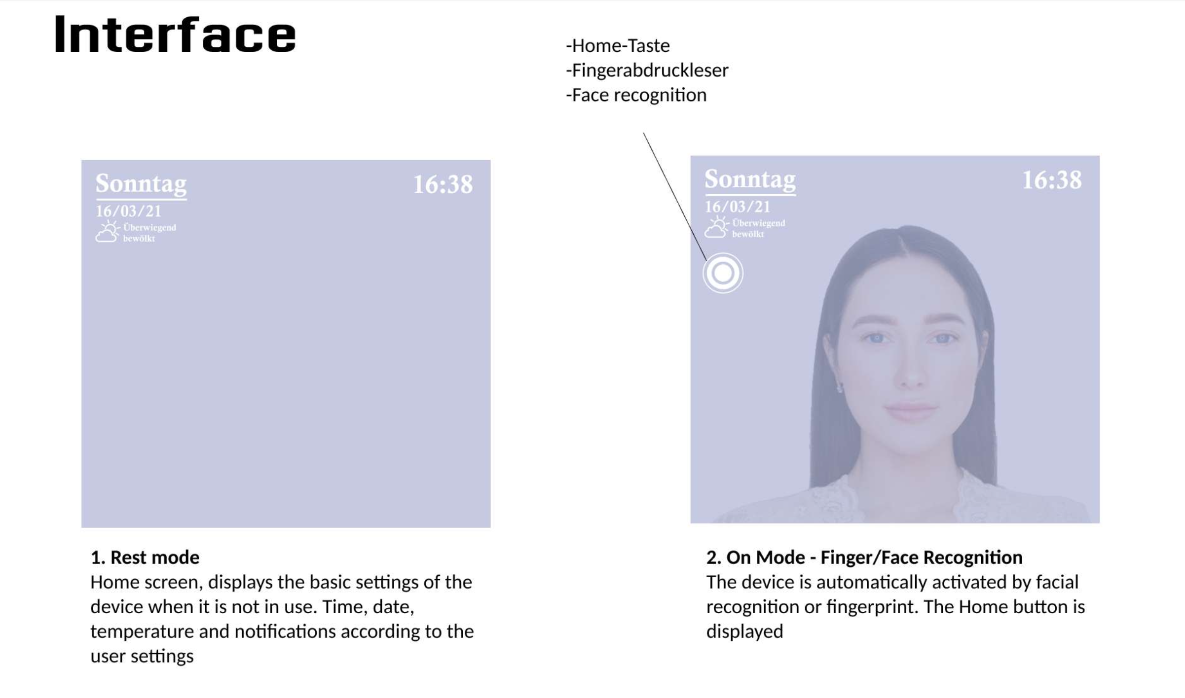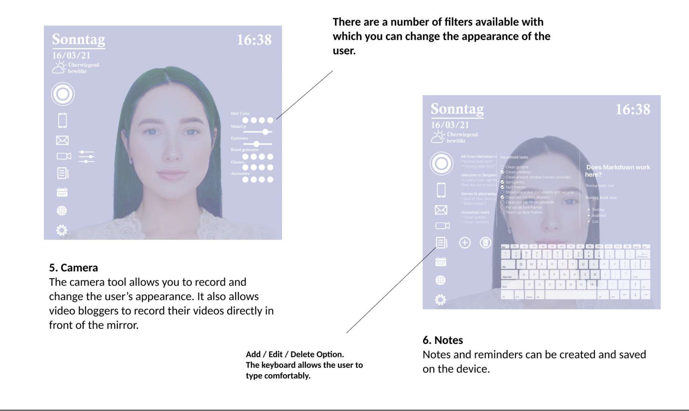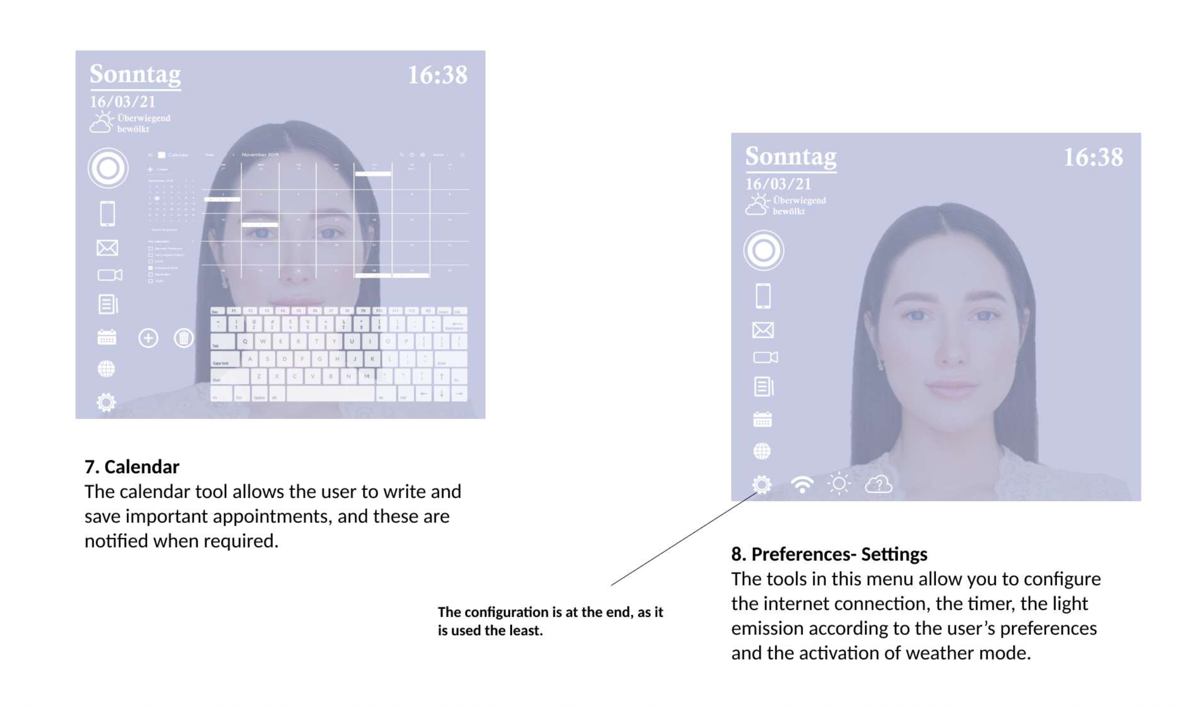

UX/UI Design, Smart Home Interface, Concept Design
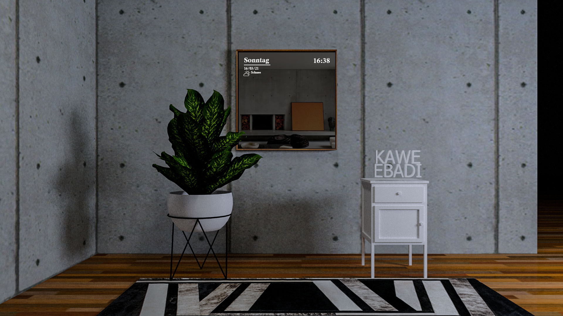
Smart Mirror Interface

View Case Study
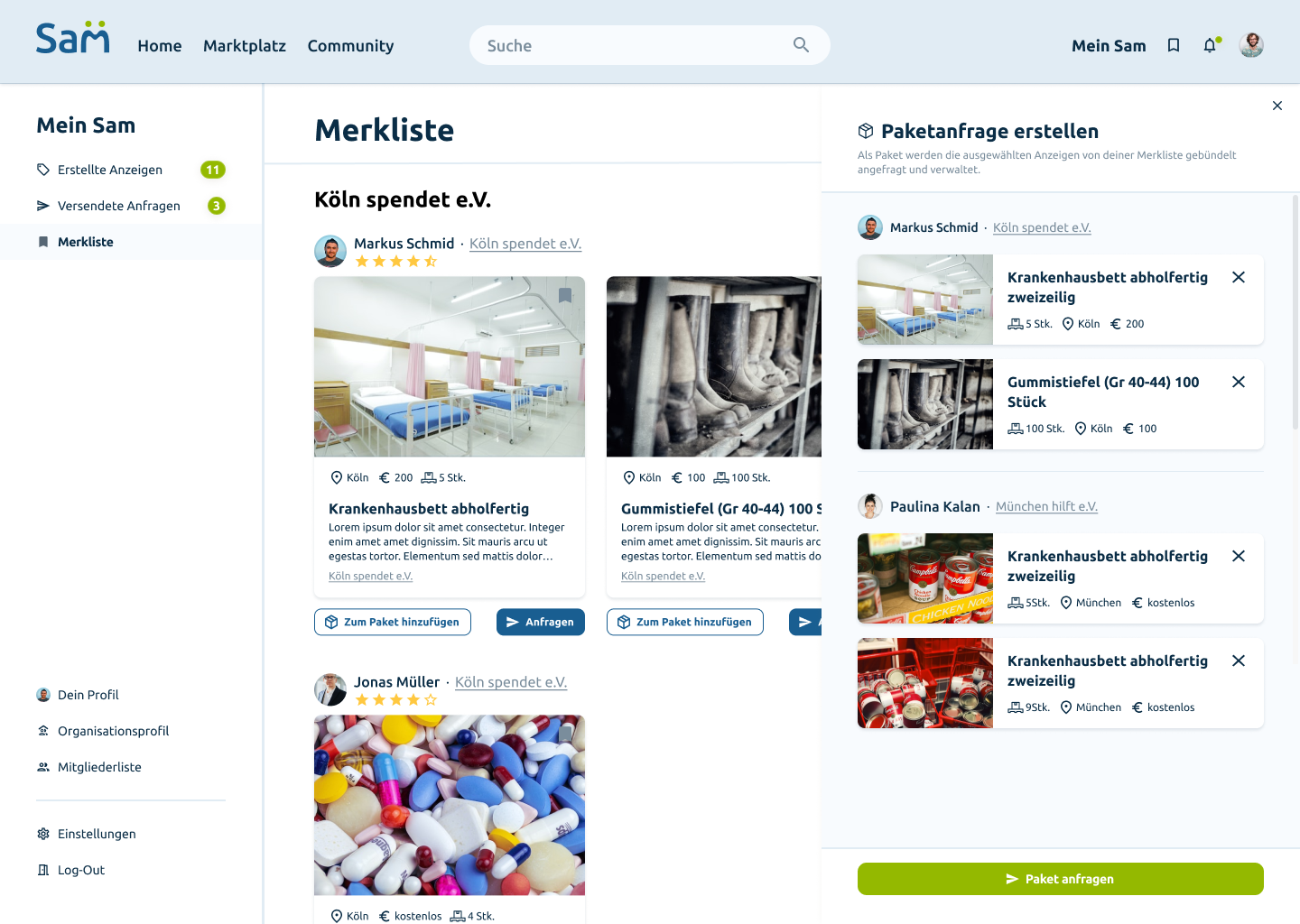
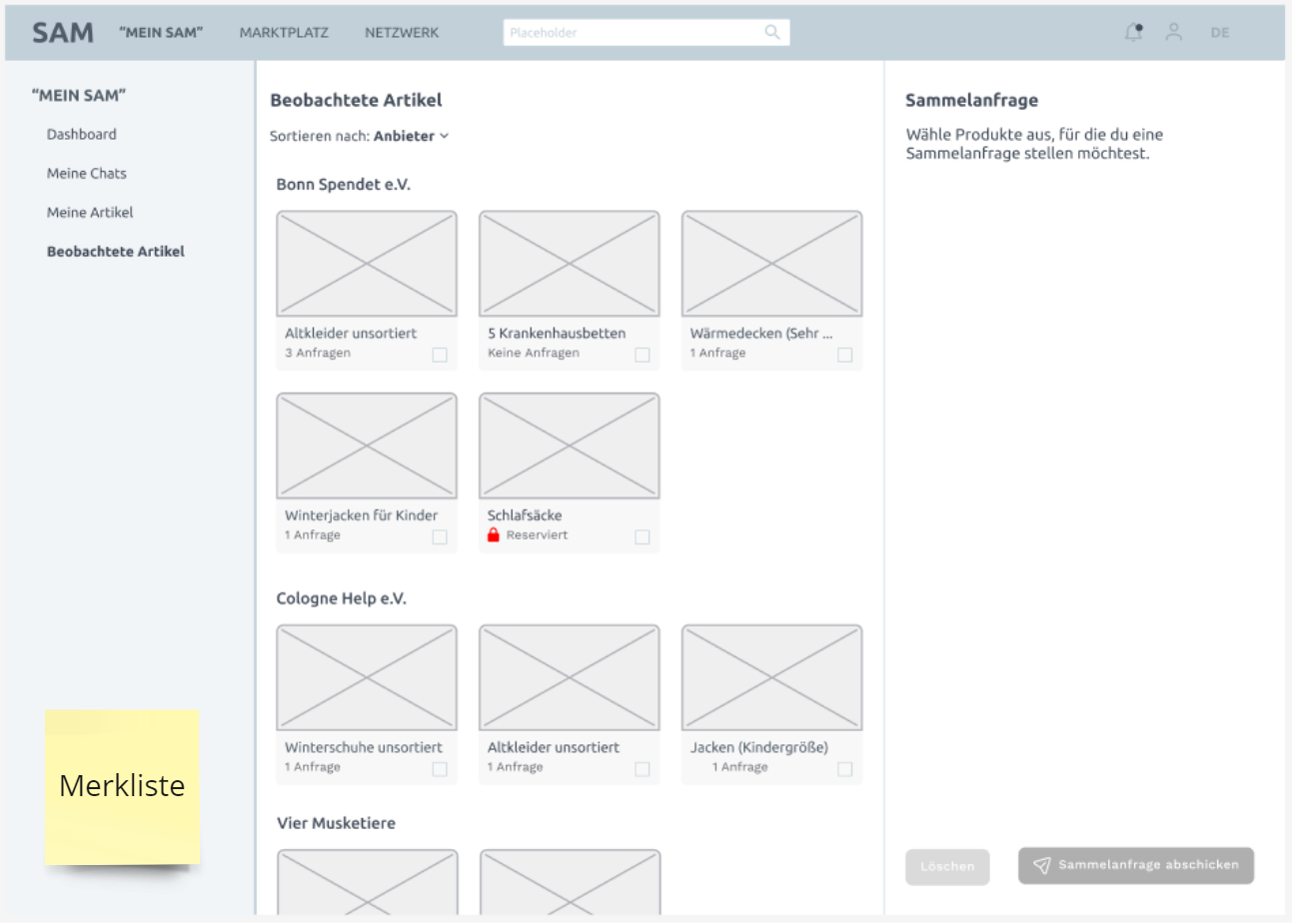
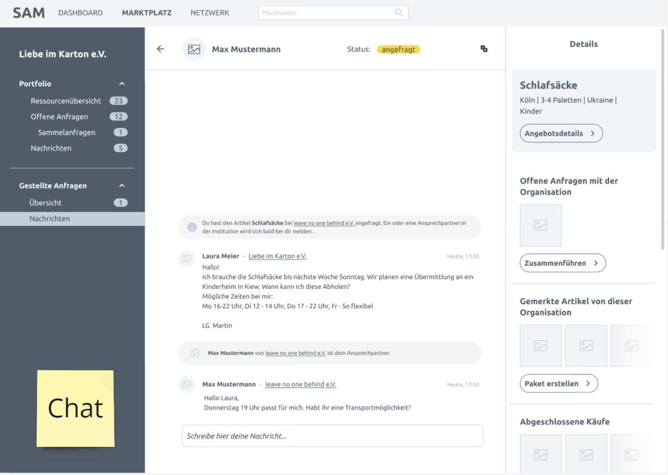
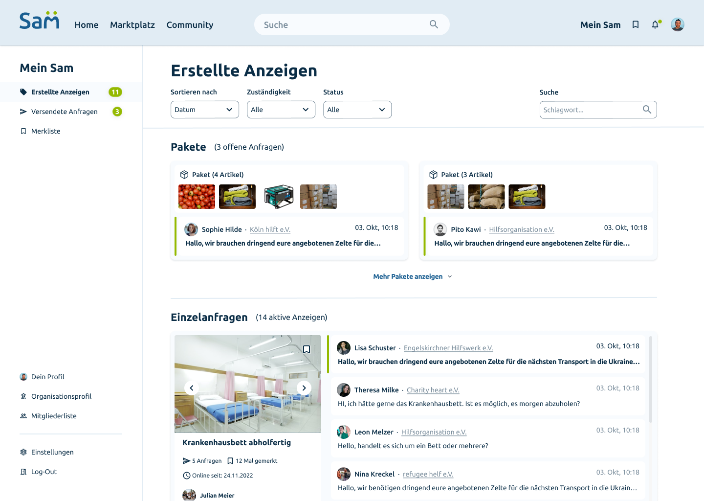
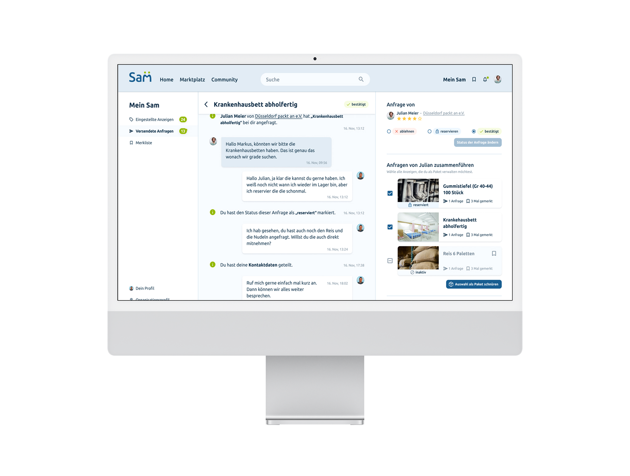
SAM is a digital platform that helps non-profit organizations manage, request, and distribute physical resources efficiently.The system enables charities to list items, handle incoming requests, chat with partners, merge multiple articles into packages, and coordinate logistics across locations.
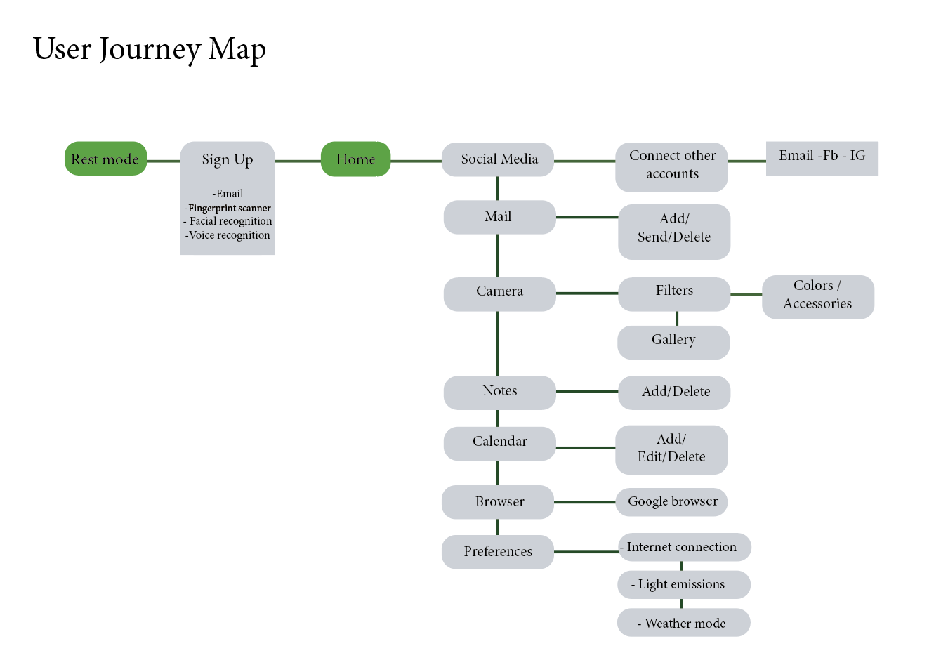
The information architecture was structured to keep navigation predictable and minimize cognitive load.Key flows like requests, chats, listings, and saved items were reorganized to ensure users always know:
•Which item a conversation refers to •Where the request originated •Which actions are possible at each step

We explored three communication models to understand how organizations manage item requests.Each model impacts clarity, scalability, and coordination.This comparison helped us identify the most efficient structure for SAM’s chat and request system.
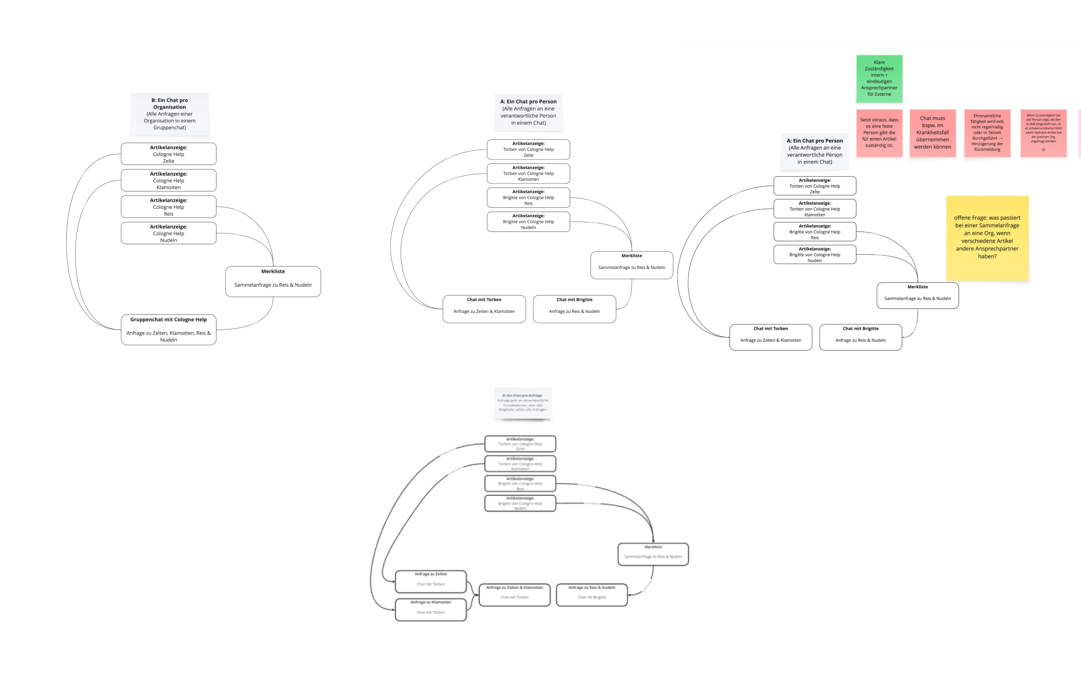
From wireframes to high-fidelity mock-upsThe first wireframes were created alongside the development of the sitemap to demonstrate the differences between the various user flow options.
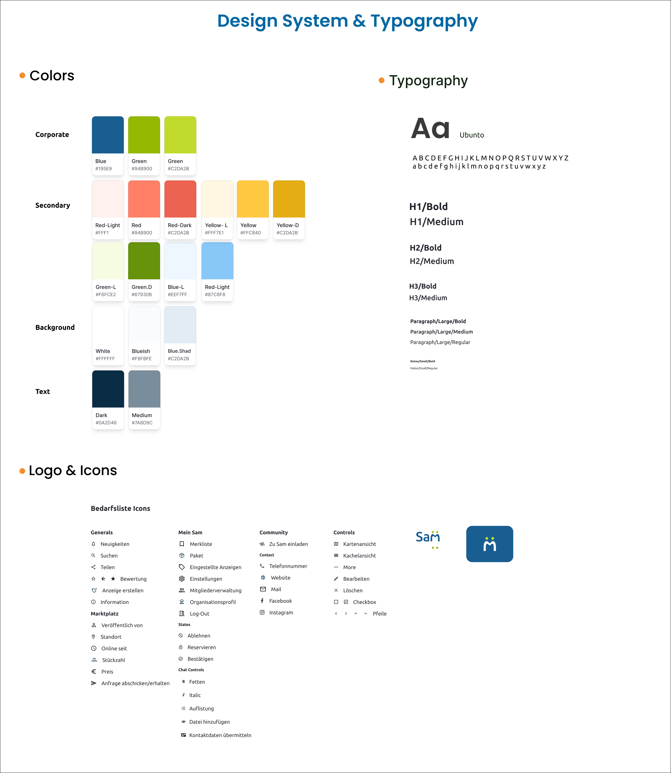
Once the corporate design team had finalised the design system, the visual design was transferred to the existing wireframes. We then developed the final high-fidelity mock-ups of the application from these, and handed them over to the customer as deliverables.

In this project, many more people were involved than were actually necessary. We saw this as an opportunity to design a large number of features with several teams working in parallel, as well as producing additional deliverables such as the promotional video that went beyond the scope of the request.
However, the large number of planned features and deliverables meant that the application's user interface became extremely complicated and confusing. This is why many of the features were subsequently removed. Working in smaller, independent teams also required a great deal of coordination, which slowed down the design process considerably.
A stronger focus on the essential core functions of the platform at the beginning of the project would definitely have contributed to a more efficient workflow.